News

The latest news from NYXdesign.  A design partnership between Abigail Rosen Holmes, Brian Gale and Emanuel Treeson

Destination Scotland

Johnnie Walker Princes Street

Back in 2019 our dear friends and clients BRC Imagination Arts approached us to be a part of the design team for Destination Scotland.  An incredibly ambitious program to reimagine the visitor experience at some world’s leading scotch distillers, including Johnnie Walker, Talisker and Coal Ila. 

At the heart of the project was Johnnie Walker Princes Street.  An 8-story temple to whisky located at the base of the Edinburgh Castle located in a historic building which was previously a Royal Bank of Scotland.  The building had been through a lot over its life having started life as two separate building and then combined into one when the bank was converted into a department store.

Christian Lachel, the chief creative officer at BRC and the creative director on the project, lead us to create a multi layered series of experiences that catered to the scotch fan and first-time explorer alike.   There was the main tour … which tells the history the Walker family, how and why John Walker created his blended scotch. It also included the creation process for whisky, and finally why you blend different single malts together to create Johnnie Walkers different expressions.   This story is told through a series of immersive spaces and theatrical shows that are all very different from each other and tell a specific part of the story.  The whole project was a thrill to design.   

©BRC Imagination Arts

Christian wanted the design to be a blend between very modern design elements and historical visual references. From a lighting point of view Christian and NYX both wanted each space to have its own visual identity.  Some spaces were tradition on first blush but hidden theatrical touches that only came to life with the shows.  Others are very modern and are full of the bold color palette that is so linked to the brand’s visual identity.  Early on we together decided that the lights, even at their most theatrical, should not pull focus from the narrative but instead elevate the scenes when called for and blend seamlessly into the architecture when not called upon. To this end the lighting was all very intelligent and featured the ability to produce a huge range of color but the lights presented as traditional forms like recessed downlights, grazers or coves.   Anything more theatrical was tucked away in lighting rafts or behind translucent architectural details.

Articulating the design for each of the many shows was also incredibly fun. For example, the show Creativity of Making. Each of the 138 cubbies of whisky are independently controlled allowing the walls of whisky to highlight the featured whiskey and to dance with the rhythm of the soundtrack. This visual design was key element in telling the story of blending scotch.

Beyond the central tour the design also featured two roof top bars, The World Bar and the Explorer’s Bothy, each with a totally different look and feel.  The whisky is always the star of the show. With that in mind, the whole team set upon central idea that the spaces would be infused with golden warm light emitting from the liquid at every angle. We then layered in luminous other elements through the design.

For the Explorer’s Bothy elements of the design included the central sculptural swirling lines of wood and light. An array of hand blown glass hanging lighting fixtures are playfully made up of three different shapes but that all share the same design language. Everywhere the whiskey is illuminated from behind or below allowing the amber liquid to spread warm lighting throughout the space. The result is a space that encourages the enjoyment of whiskey, music and conversation.

In the World Bar a different technique was employed. Here natural light and view of the castle were front and center. Christian wanted the modern stained glass skylight be color and inform the guest experience. As the sun moves though the sky the geometric patterns of color shift around the room. We designed in ceiling lines whose curvilinear inner surfaces are lit from hidden miniature coves. The design goal is to have infinite effect colored light that wraps around the room. We layered in very thin hanging fixture to cast light down and augmented with classical modern floor lamps to create a sense of intimacy to each seating group.

One the greatest challenges was lighting the exterior of the historic building and not letter the physicality of the lighting fixtures distract from the building itself.  We took years working with the town council to design and implement a system of shields that hid the lights from view and that were color match to the building to help the whole system blend into the building as a whole. 

The Distilleries

Talisker

Johnnie Walker is a blended scotch and it is made up of many single malts each with their own distillery.  As part of the Destination Scotland program BRC reimagined and created visitor experiences at many of these key distilleries.  They asked us to be on the team for two of these.   Talisker and Coal Ila, both on islands off the coast of Scotland, have identities very closely connected to landscape where they are located. 

Talisker is one of the most famous distilleries in Scotland. Sitting on the remote island of Skye, the whisky flavor is heavily influenced by the surrounding sea and rouged landscape.  Christian knew those elements had to be contained in our approach to the design. All the aspects of the design flow from this direction. From the large drum mural that encompasses the central welcoming space, to the bar space that contains a modern nautical design, to the main show room that features projection mapping on its central tasting table. 

©BRC Imagination Arts

Coal Ila

Throughout Talisker’s guest experience lighting we found ways to imbue the whiskey with light that seems to come from the bottle or glass itself.  In the main tasting experience each seat has three tasting glasses that each sit on tiny little LED source milled into the table.  Each light in independently controlled allowing for the guest to know just which glass to chose.  In the other group tasting experiences the feature wall contains all the expression of the whisky and each bottle sits on top of the light.  Here the whiskey not only glows from within but the its hue colors the light as cascades on to the wall the cubby the bottle sits in.
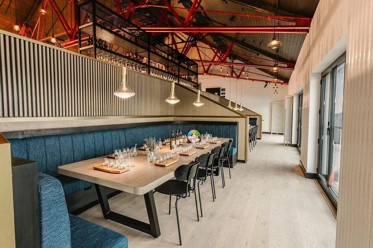
Coal Ila, located on Islay, is famous for it’s peated whisky.   For this project Christian wanted an elevated tasting experience that captured the distilleries connection to the island of Islay.  So, the team designed beautiful natural wood tasting tables that sit looking out on the surrounding bay.  We selected the Cathode fixture from Davide Groppi to illuminate the tasting.  These hand-blown fixtures clearly echo the hands of their maker.  We wanted the design of the fixture to reinforce the central idea that whisky is crafted thing guided by the makers.   Also, their function of casting their focused warm light directly down on the table created sparkle and glow within the whiskey being tasted. 

©BRC Imagination Arts

We are really honored that this project has received significant recognition over the years. Johnnie Walker Princes Street and Talisker both received IES Awards of Merit for the lighting Design. Also Princes Street won a Thea Award for the project. The project also recieved honors from The Scottish Design Awards, The A/V Awards, and the Muse Creative Awards.

Ravinia Music Box

Interior of Ravinia Music Box

In the fall of 2016 long time client, BRC Imagination Arts asked Manny to join the team designing the new Music Box Experience Center at Ravinia Festival. Beginnings are always exciting and this project was no different. The Music Box project, led by Creative Directors Brad Shelton and Edward Hodge, contained elements of exterior building lighting, hospitality spaces, general circulation lighting that needed to connect to the pre-show experience and at the center of it all, a theatrical design for an immersive experience celebrating music and legacy of Leonard Bernstein. 

The jewel in the crown of the project is Bernstein’s Answer, a 10 minute immersive experience that asks the question of music’s impact and meaning. It explores the question by using music, projection, lighting and Bernstein’s own words & thoughts. Everything in the theater reacts to music and emotion. Manny explored ways in which the environmental and scenic lighting could lift and transform moments and the audience’s perception of the those moments. 
As the experience explores the topic of music’s power to transform and move people’s emotions, so too does the physical space of the theater itself transform. Projection and light both begin the show being very focused within the theater’s proscenium. As the show opens up with Bernstein’s music, so does the theatrical fabric of the show with projection and light expanding to surrounding the audience. It was a delight to design Bernstein’s Answer, a show that has such powerful music at its core, with all the team members at BRC. Lighting and music are two artistic expressions meant to dance with each other and on this project that dance helped build the emotional core of the show’s message. 

For the exterior of the building there is a bar space that sits on top of the lobby and pre-show spaces. Manny and BRC Creative Director Edward Hodge began by considering how the building would be seen from the lawn of the festival where so many of the guests experience the concerts from. The bar was always conceived as an island of color floating on top of the building. For the bar there were two major criteria. First, that the color all came from concealed sources. Manny wanted the impact to be from the color environment and not the point source of the light itself. The second major gesture was the ceiling of randomly laid out tiny aperture downlights that created the low level circulation lighting. Manny carefully considered both the location of each fixture but also their random circuiting combination to allow a carried intensity level from the point sources without a perceived pattern.

Rounding out the project was the gallery and circulation lighting. The BRC design concept for the whole building was centered around a design language of asymmetrical lines and shapes, and in the gallery and pre-show spaces Manny designed a track system that echoed that language.

The joy of the Music Box Experience Center for NYX was that is a complete project that encompasses the entire theater building, requiring many design skills and disciplines to come together to make for an impactful experience for the guests. It was a joy to be on this team.

Ravinia Music Box Exterior Image
Interior of the Ravinia Music Box
Interior of Ravinia Music Box

Phish

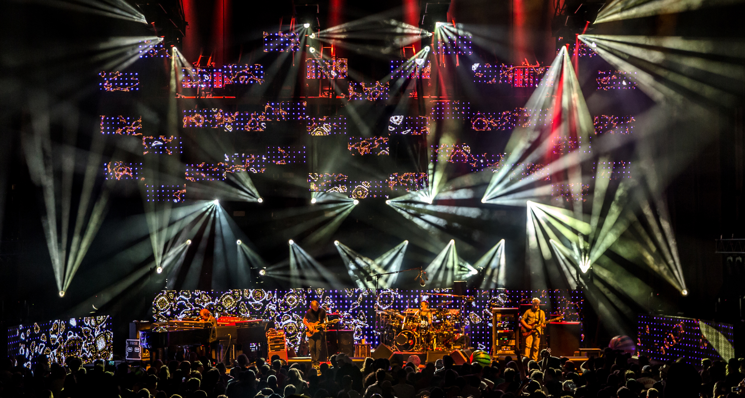
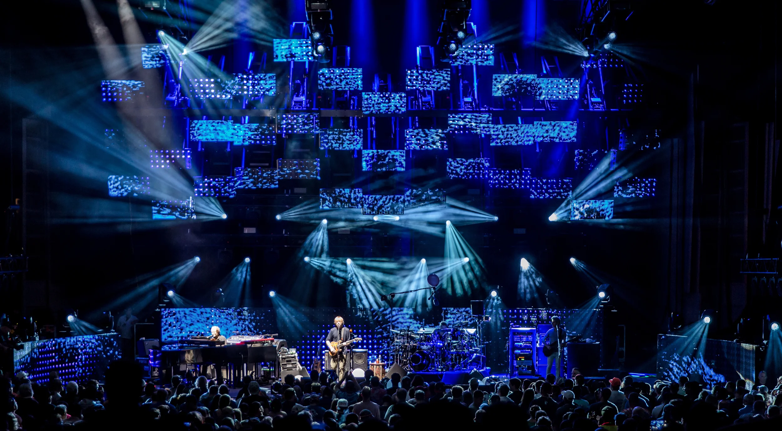
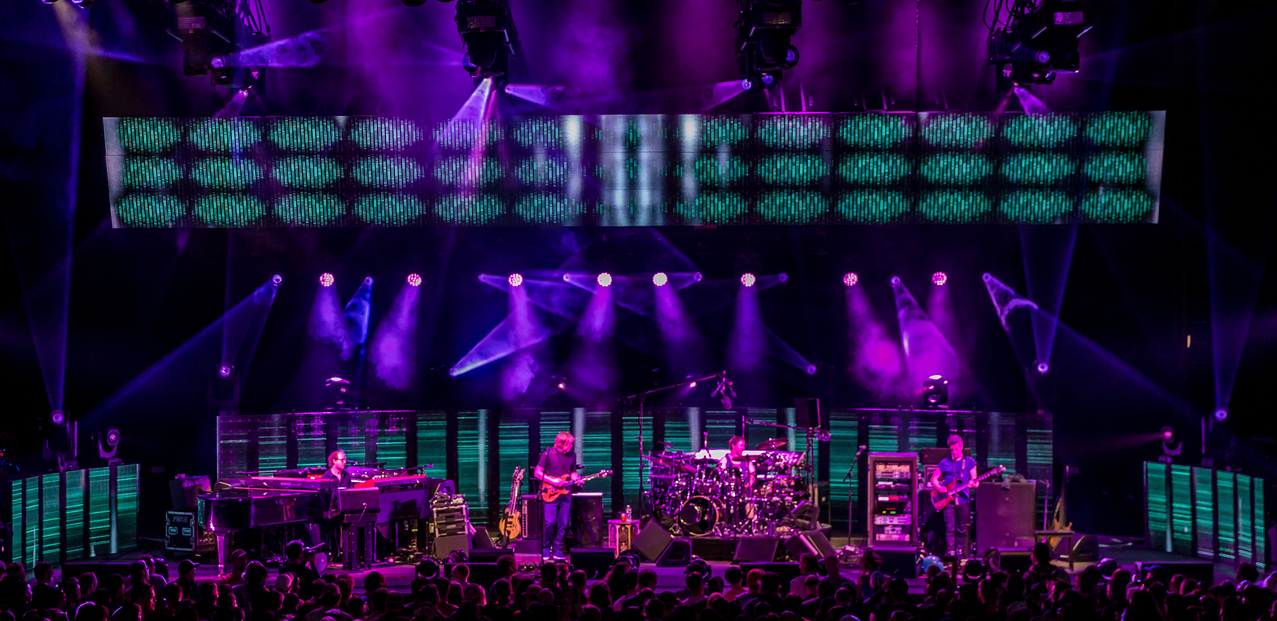
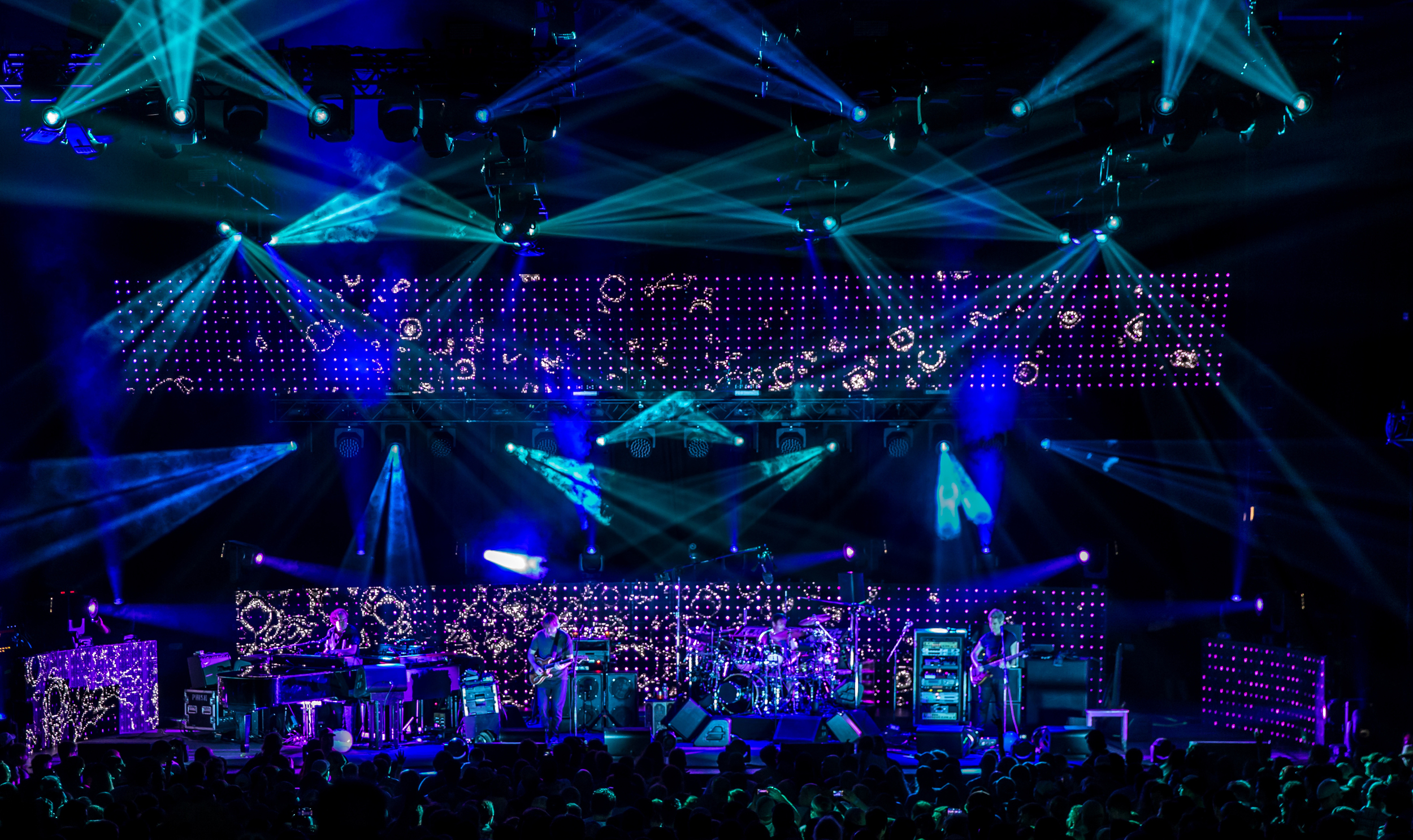
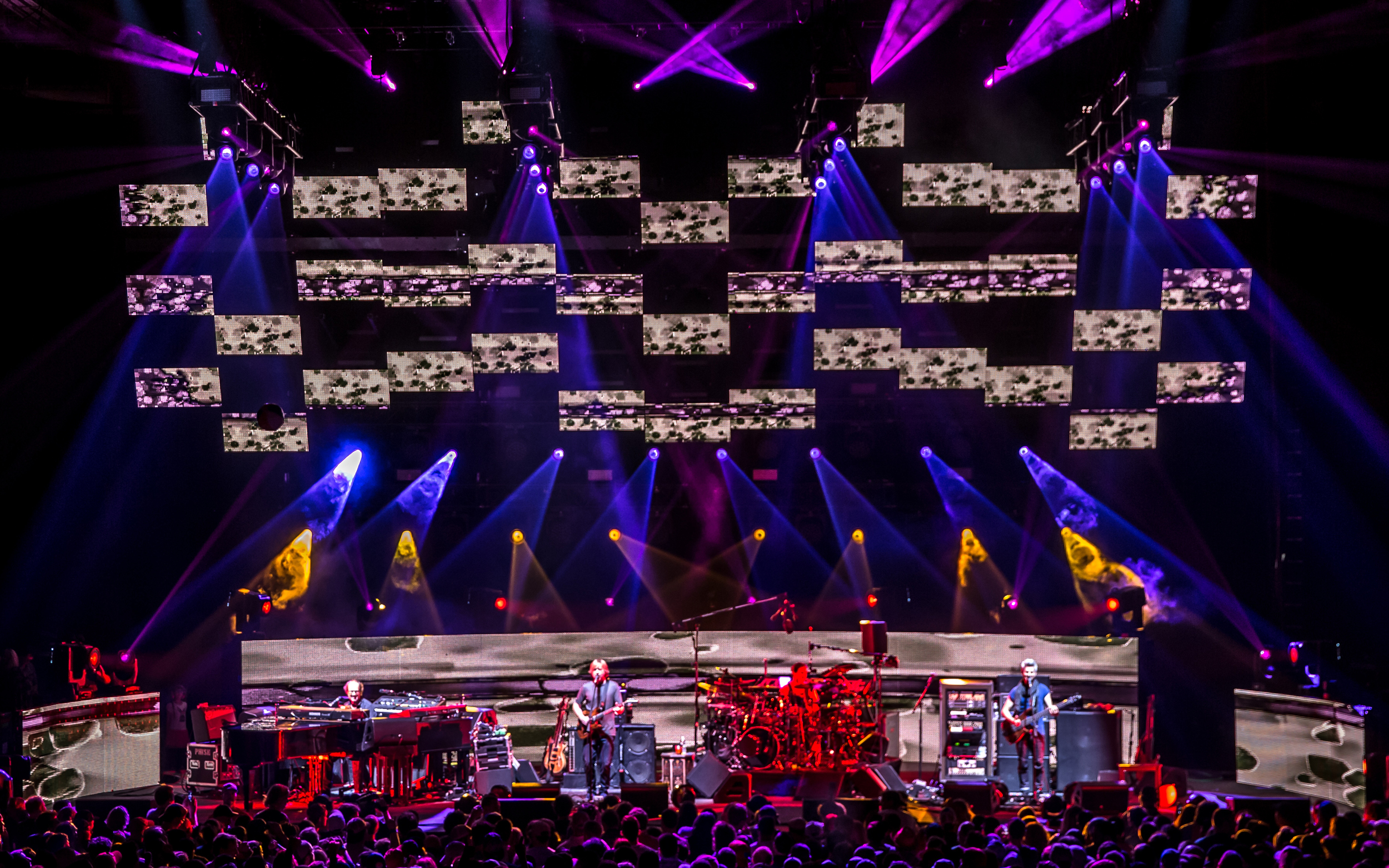
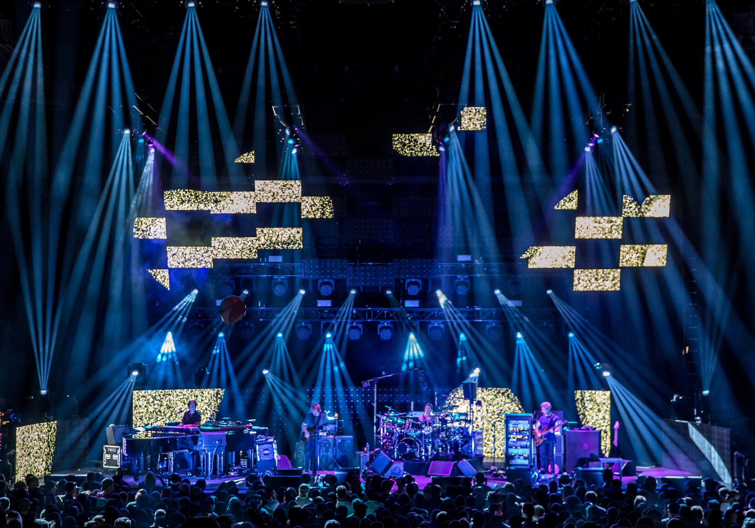
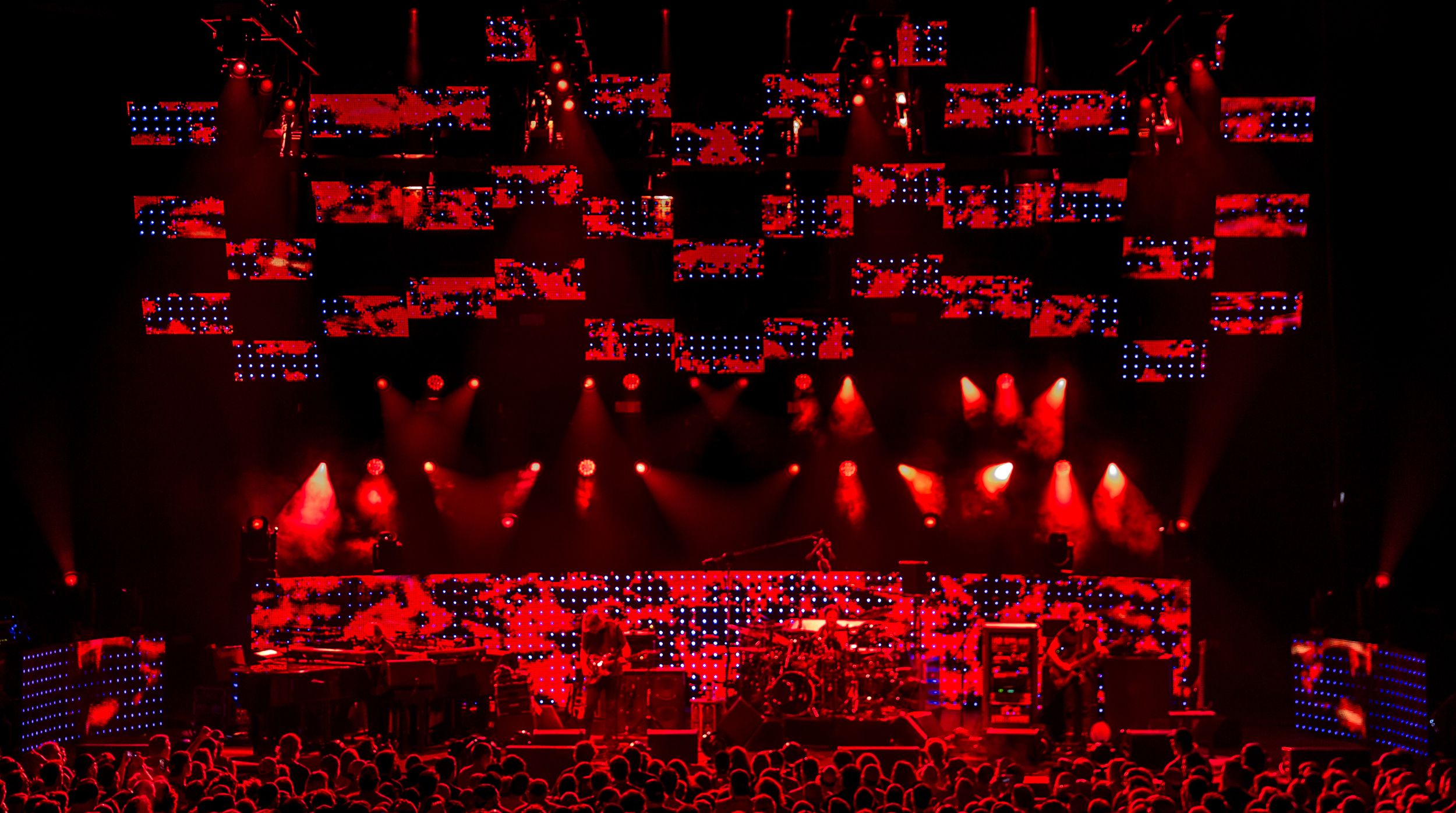
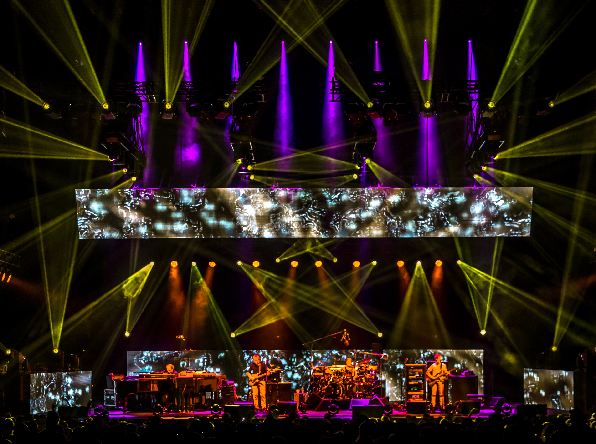
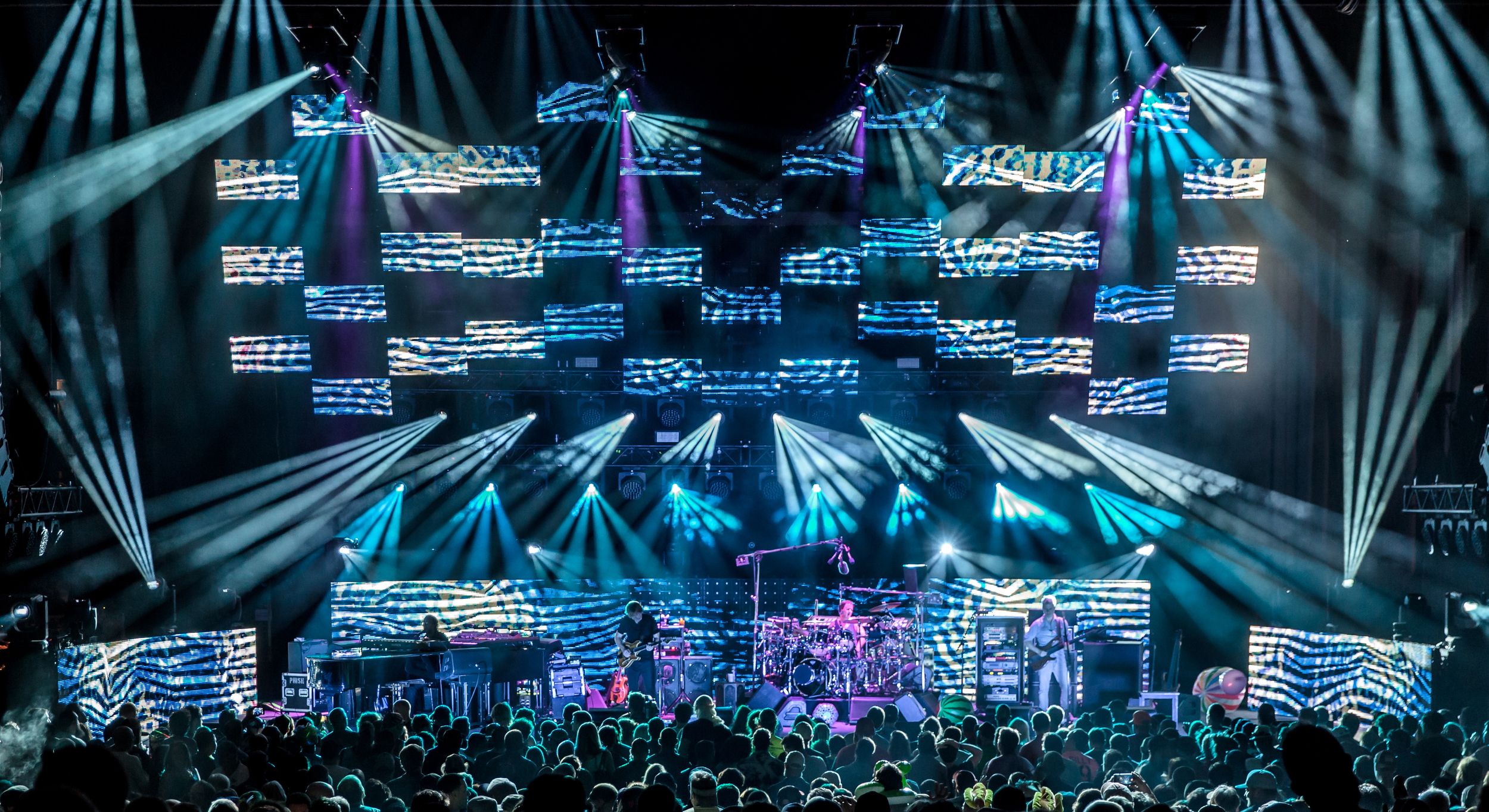
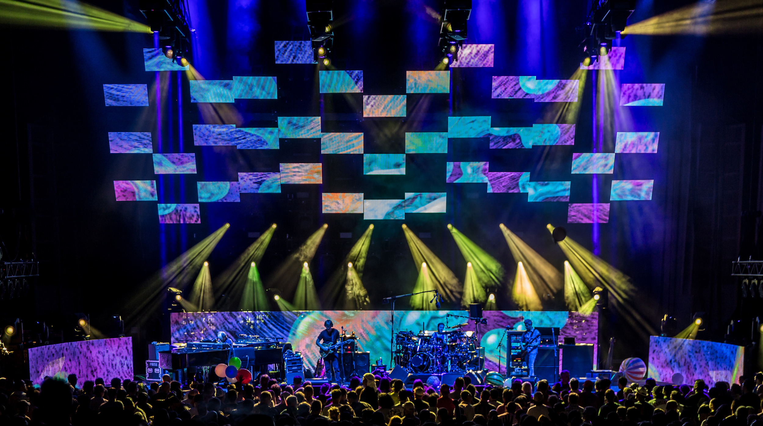
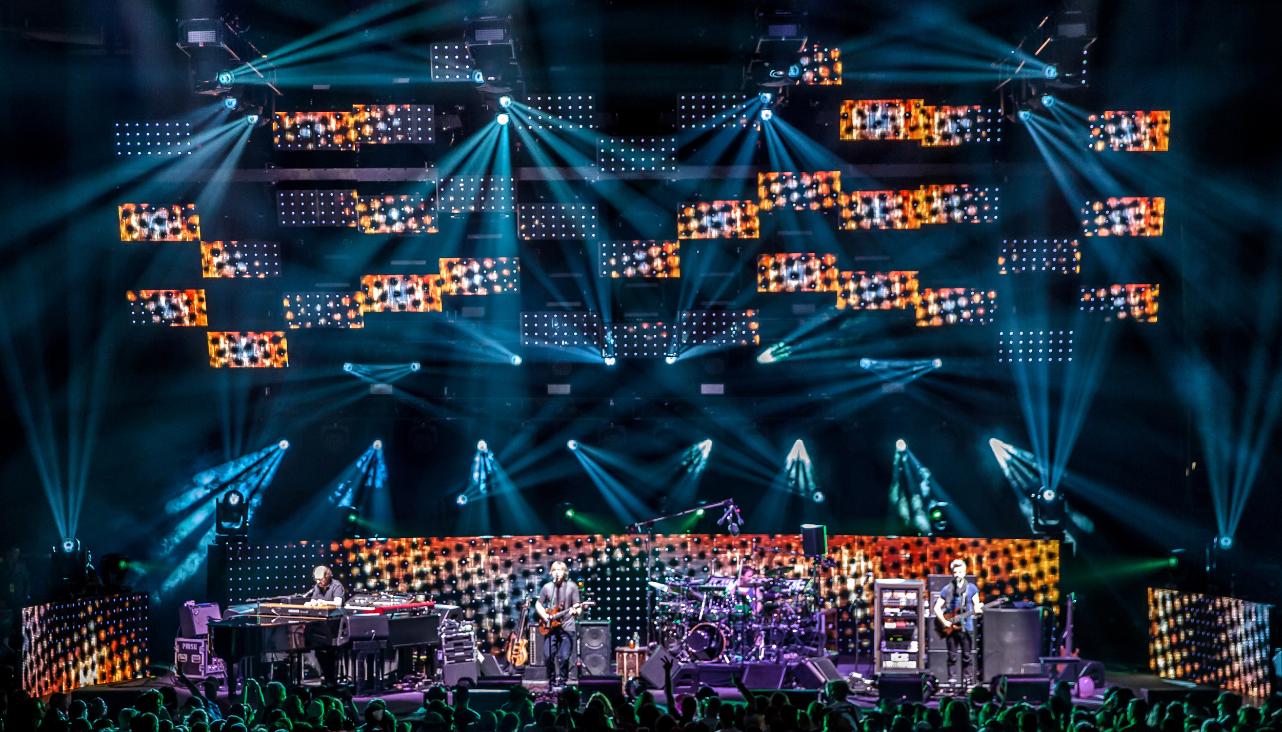
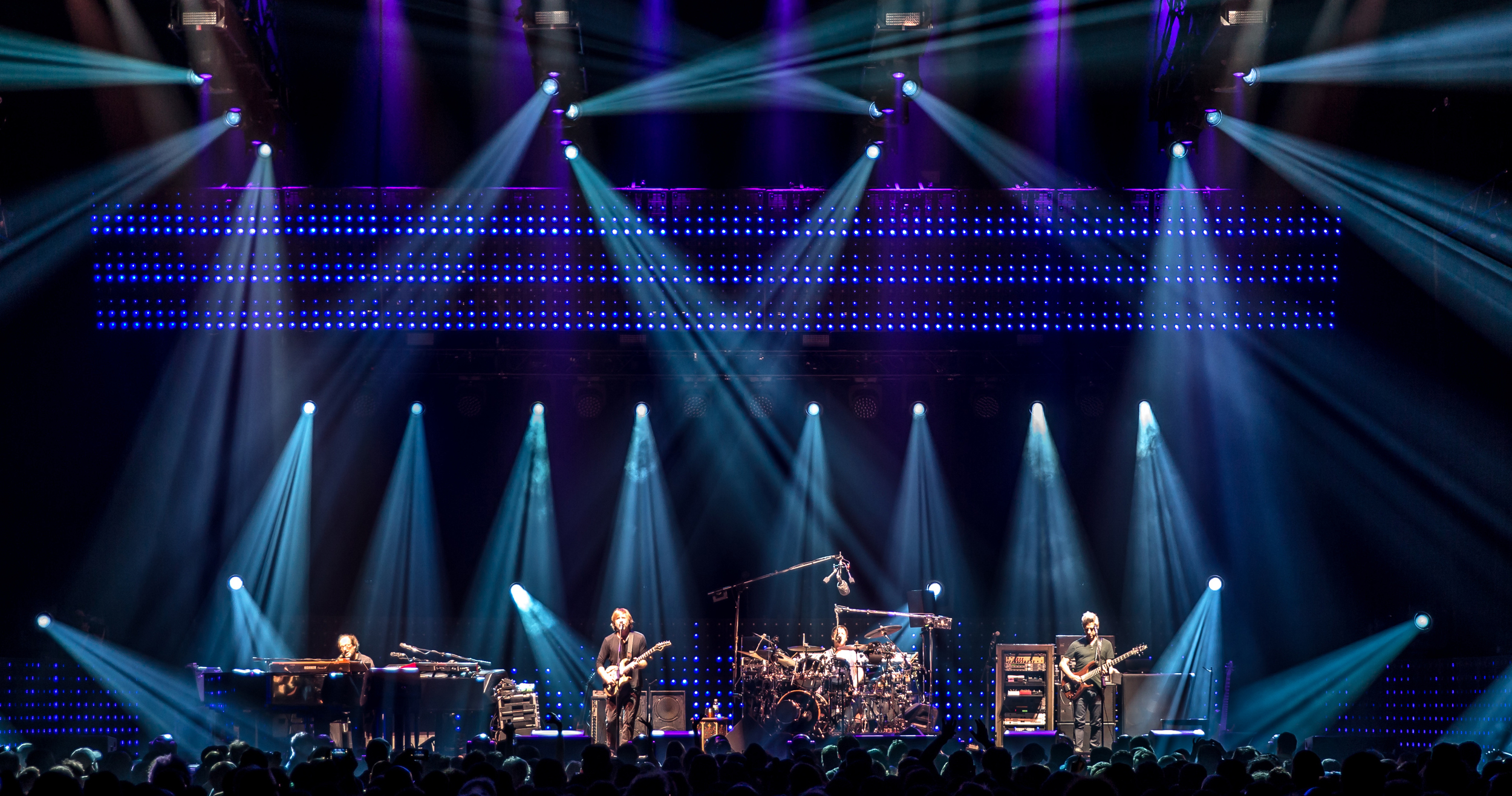
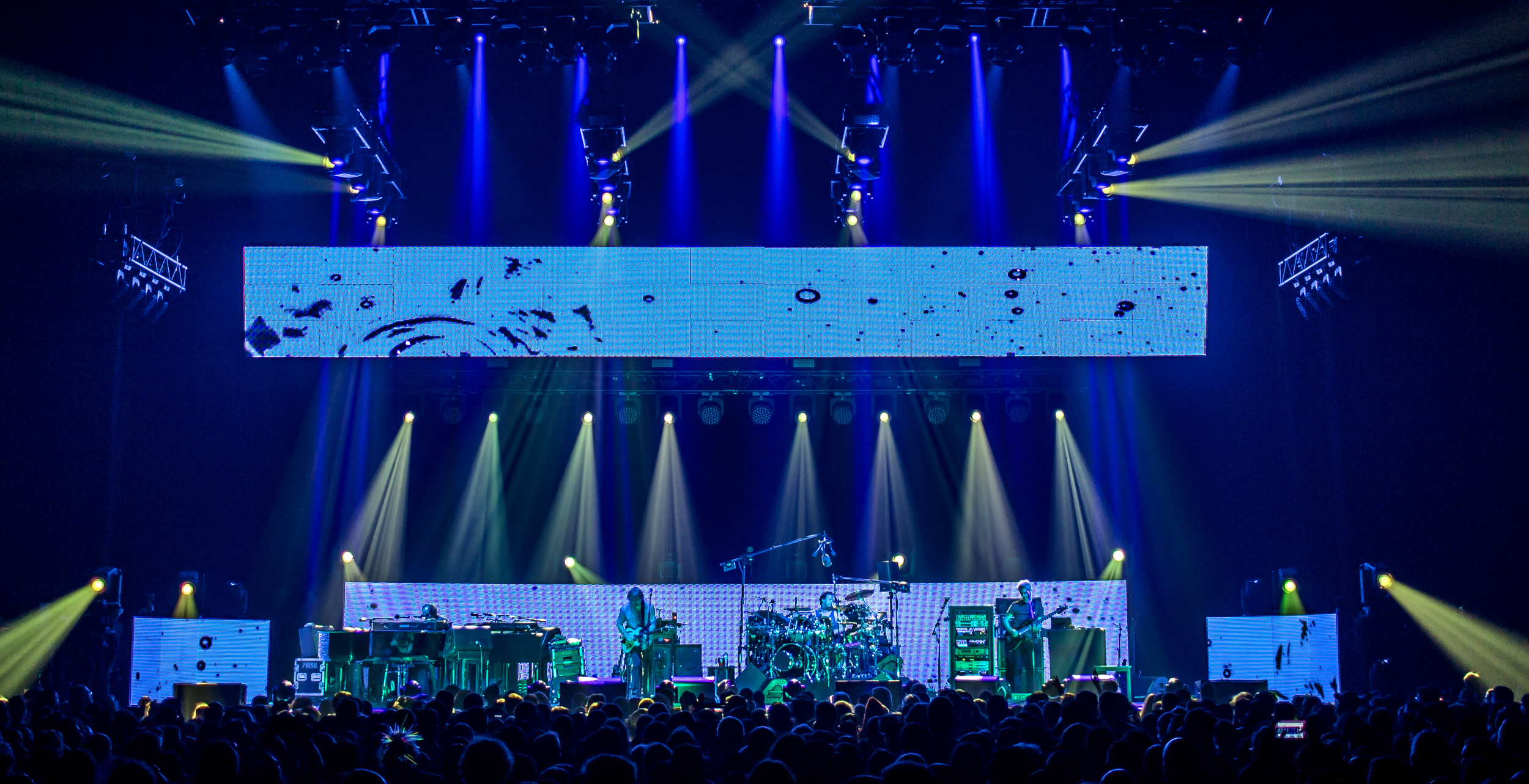
Abbey was invited by Chris Kuroda to collaborate on a co-design for the current Phish tour - An amazing opportunity to work together on design for this legendary band and their incredible live performances.  The goal creatively for introducing and incorporating a video element into the Phish touring show was that the lighting and video function as parts of one visual system.  

The production design for the show consists of a clean, simple architectural environment created by the video screen surfaces.  A low semi circular video wall encloses the band and defines their performance space.  During the first set a slim, stage wide, rectangle of video screen hangs above the stage;  echoing the minimal, linear array of the floor LED.  The lighting for set one is trimmed low, close to the screens, creating an intimate environment.

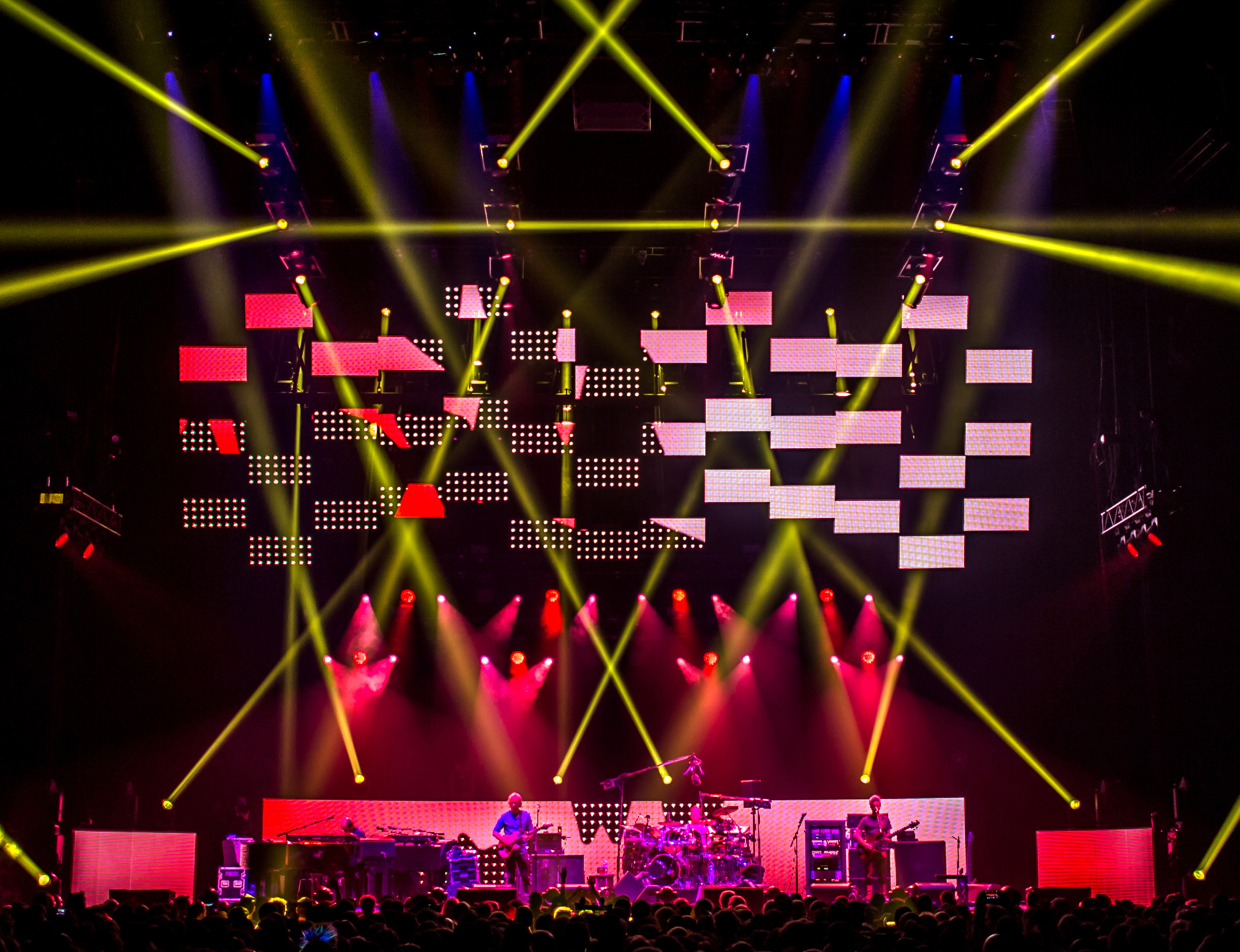
At the start of the second set the flown screens pull apart and and deconstruct into an array of irregularly spaced individual tiles.  The lighting positions travel out at the same time, opening up the shape of both systems; enlarging the scale of the performance environment and creating a flow of areas of negative space.  

In the first parts of the show the video content is more spare, and minimal, often filling the entire area of the screens in overlapping, shifting planes of color - to establish the architecture of the set, cleanly present the band in the performance environment, and introduce the visual element of the screens into the show.  In the later parts of the show both the physical environment and the content evolve to be looser, more broken up, less flat, and more active.  The images travel more across the screens; sometimes distorting and redefine the shape and space. 
The content design takes advantage of the Roe Hybrid tiles, which provide both a medium and a high resolution surface in one plane.

Lighting and video are operated completely improvisational by Chris from one console.  The video content was created by Abigail and Dan Scully.  The incredible expanding screen was provided and design engineered by Tait Towers.

Ford Rouge Factory Tour wins THEA Award for Outstanding Achievement

Manny was  thrilled when the folks at BRC Imagination Arts asked us to design the lighting for the  Manufacturing Innovation a 360 degree theater that is part of the Ford Rouge Factory Tour.  We were even more thrilled when we learned it won a THEA Award for Outstanding Achievement.   

The show was conceived to celebrate the launch of the new Ford 150 truck which is built at the Rouge Plant, Dearborn MI.   The audience experiences how the truck was designed and built through six screens that immerse the audience in a 360 degree experience.   The show uses projection mapping on the 150 to illustrate the journey the truck takes through the manufacturing process.   

We designed the lighting throughout the theater to wrap around the audience and immerse them in the experience of the show.   We lit the walls behind the screens as wrap around cyc and we embeded small puck lights in the floor in a grid.   We were then able to extend the canvas of the theater by using the floor and walls together in pixel map.   The effect is a fluid radiating wash of color across the theater in sync with the music and narrative beats of the show.   

A real highlight for us was conceiving the lighting for the manufacturing robots that are central to the show.   It seemed natural that instead of lighting the robots from above or below, the robots themselves should emit and glow with light.  This way no mater where in space their arms move they always are alive with light. 

NYX joins the team for Honda & Acura

This year Manny was invited by his client, Spinifix, to join the team for the Honda and Acura press conferences for the whole auto show season.  In each city NYX needs to support two shows in two different spaces so naturally Manny asked Brian to also join the team.   

While Manny serves as the designer for both brands up front on site for this year's The Los Angeles Auto Show, Brian was the designer for Honda and Manny was the designer for Acura.

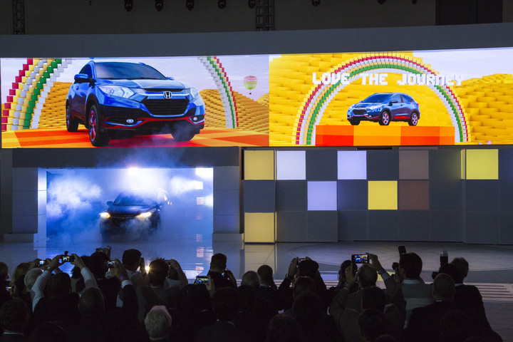
For Honda this season, the design centers around a ever changing array of pixel mapped cubes.  For each city, the cubes are arranged in a different pattern and Manny creates a different pixel map for Spinifex and then they create the reveal video that stretches across not only the ultra wide screen video wall but also down onto the cubes as well. 

In Los Angeles, Honda revealed the New H-RV and the reveal video's creative was centered on a cubist/mindcraft look.  The lighting design continued the cubist theme with Magic Panels within the garage for the car that Brian cued to first appear as full cubes but as the reveal progressed those cubist patterns were deconstructed into smaller and smaller square patterns.

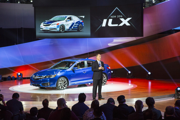
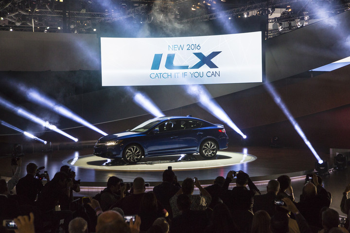
Acura debuted the new 2016 ILX and Spinifex wanted to work with volumetric light as design motive. The creative direction was to use light as architecture that could be reshaped through out the reveal.   In the auto show environment getting enough darkness to perceive this effect can be challenging so the team leaned heavily on sharpys who beams have enough energy to cut through the background noise of the auto show floor.

Detroit is up next and the team is hard at work getting ready.  Watch this space for the next update from the season.


Xbox E3 2014

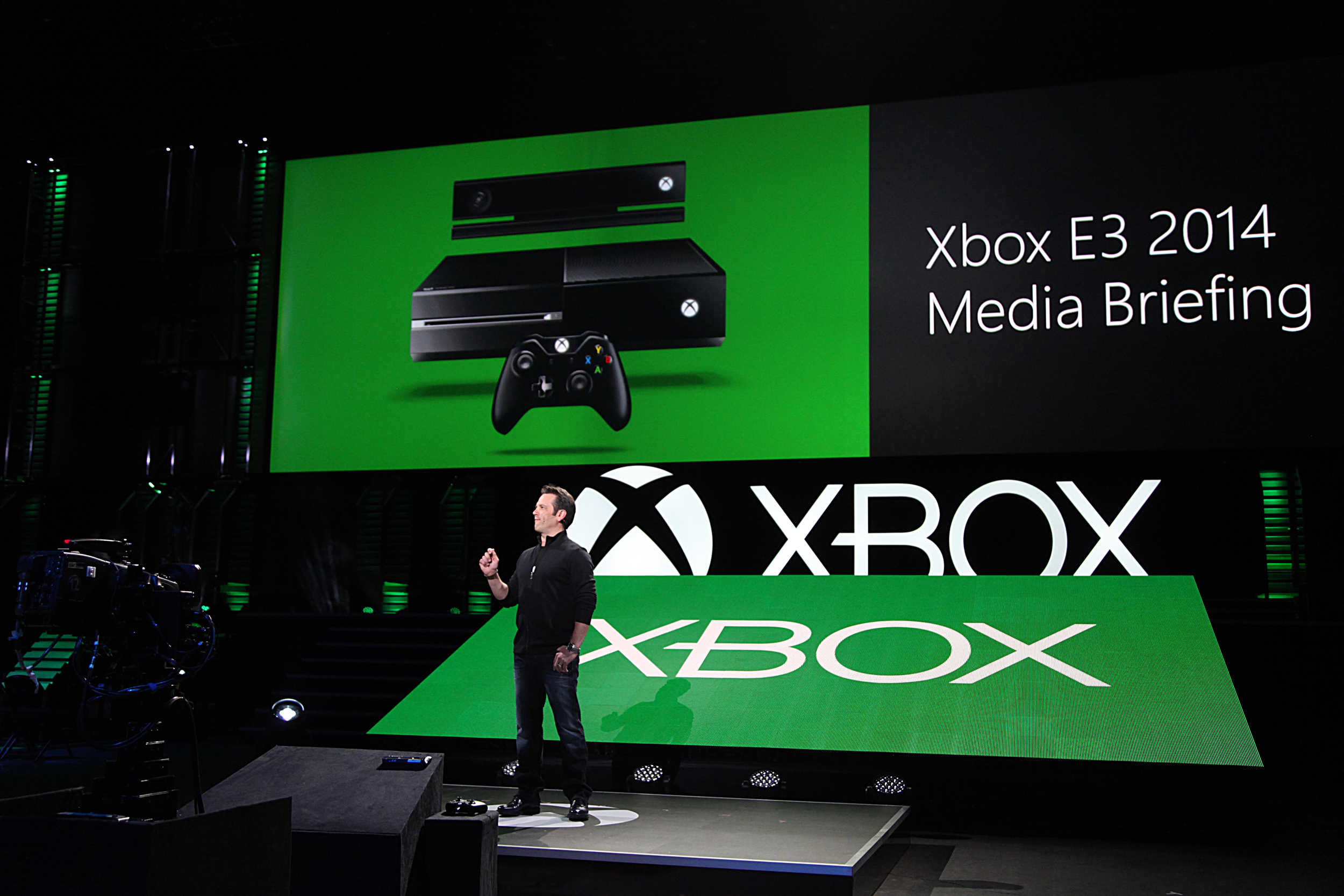
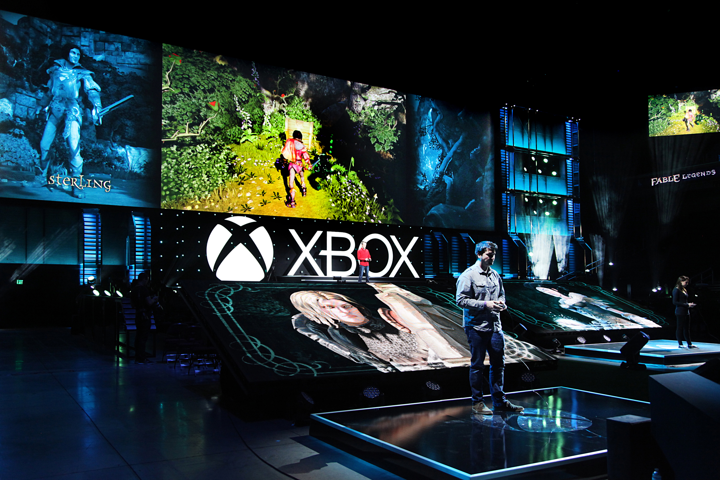
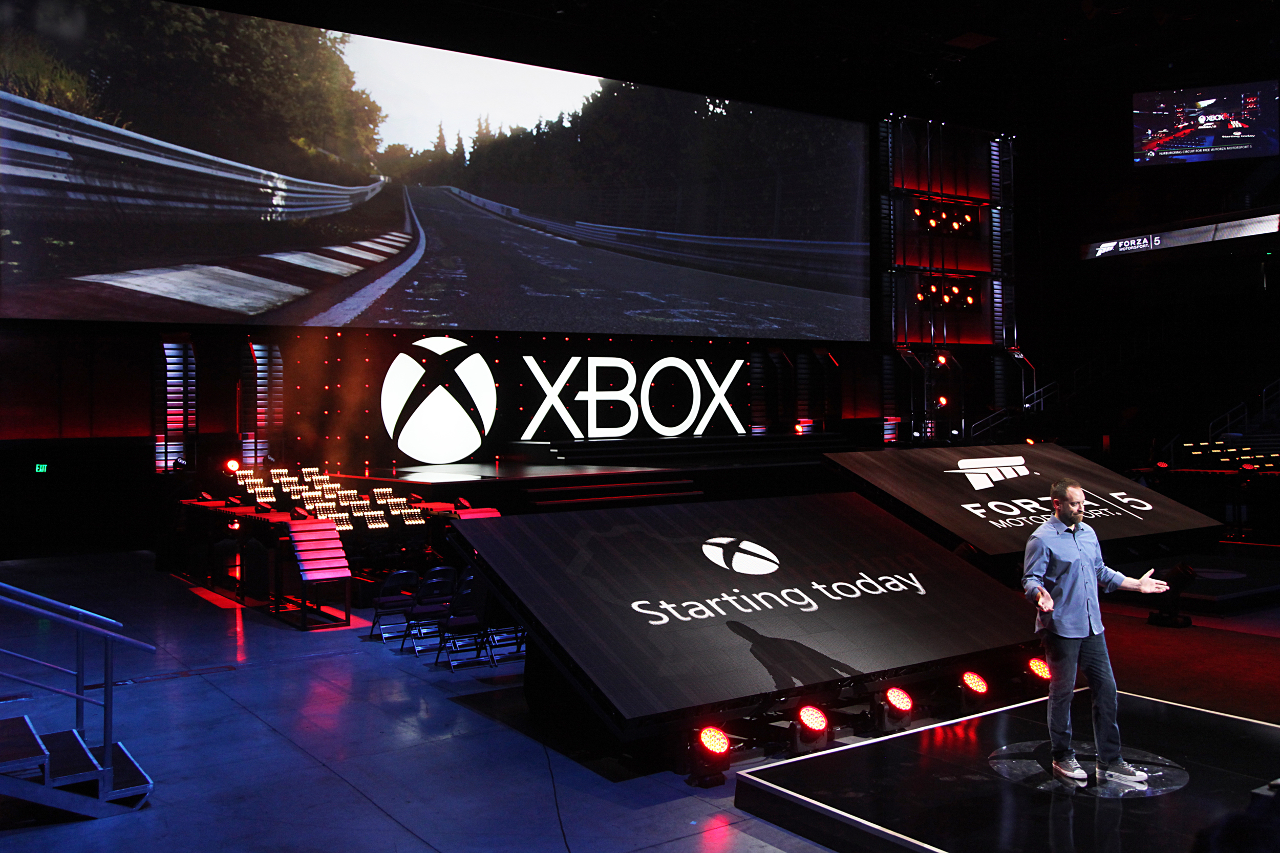
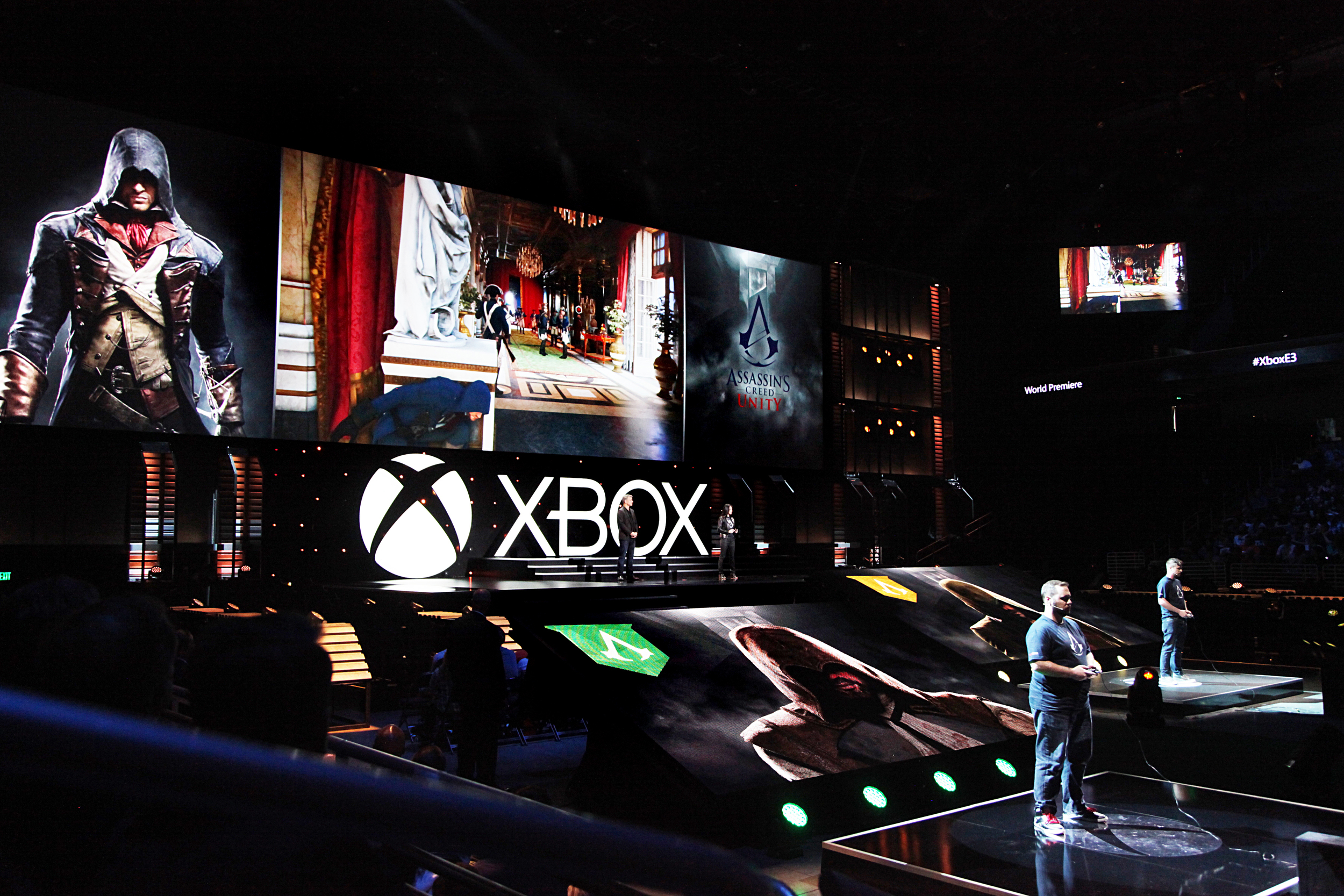
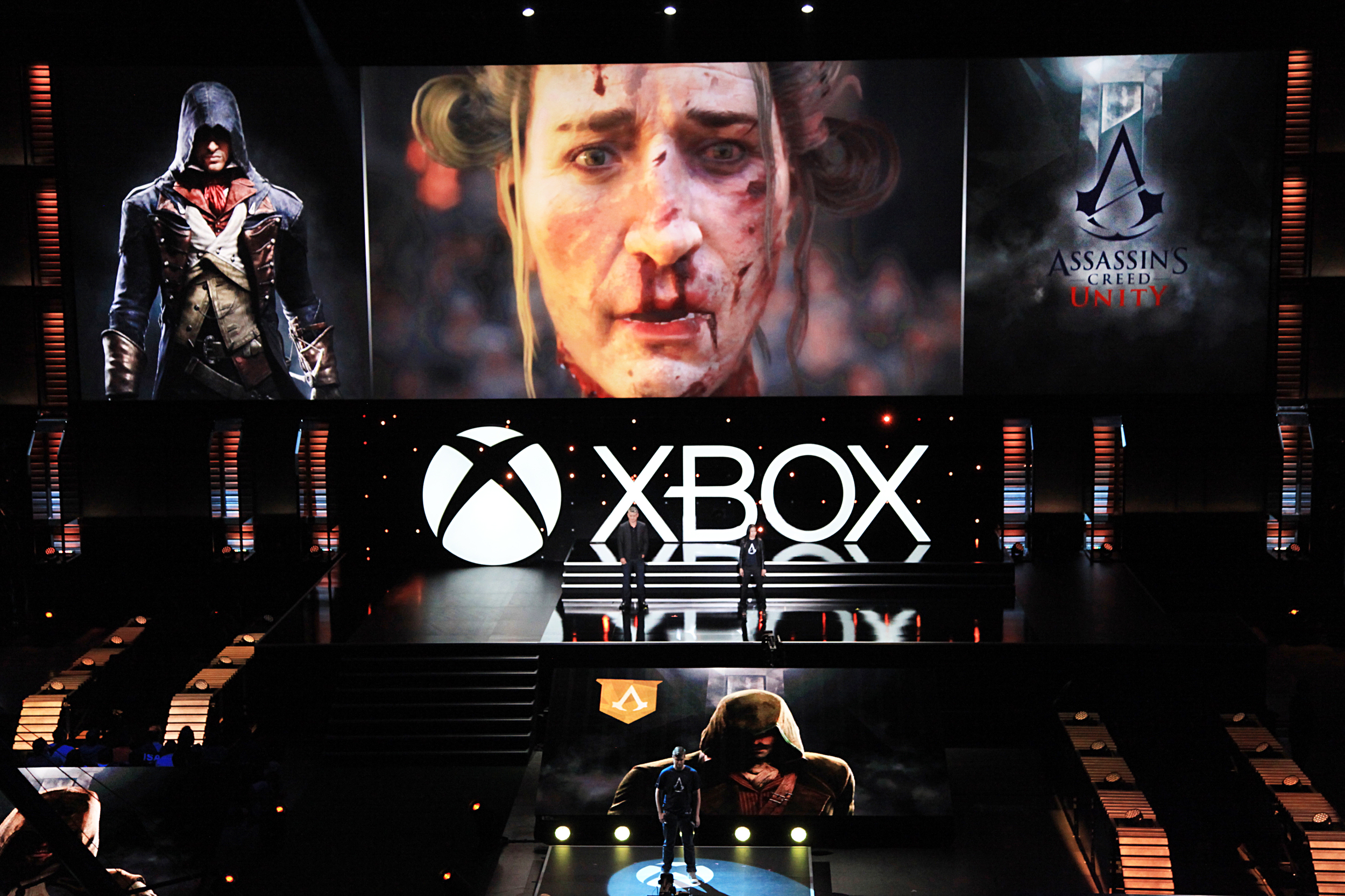
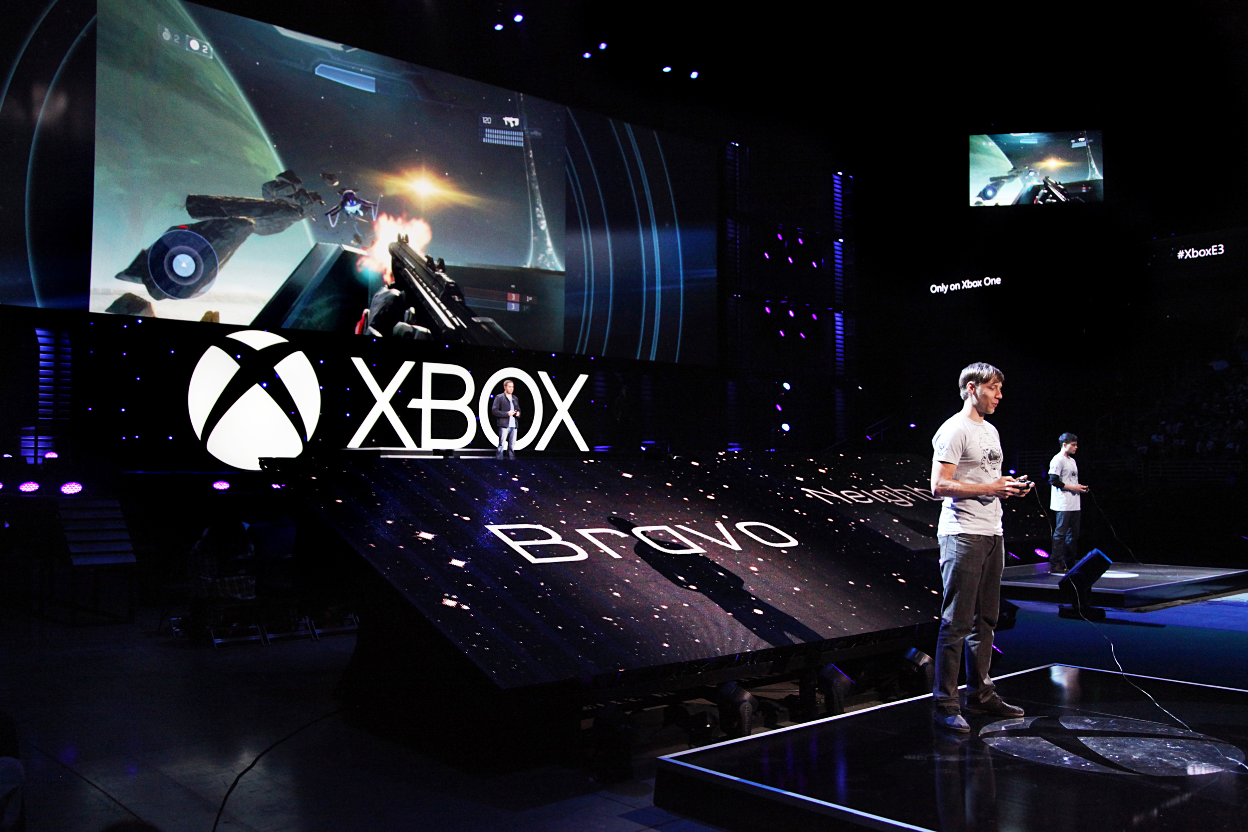
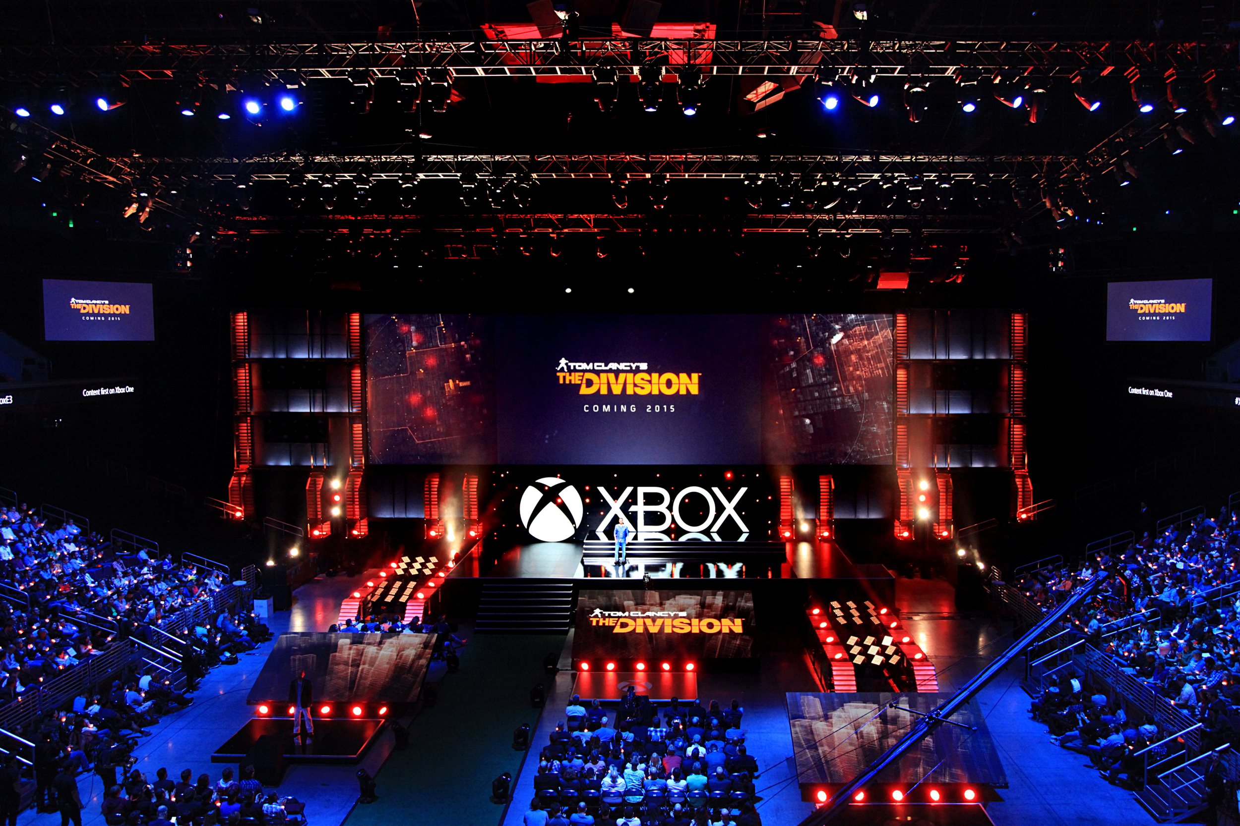
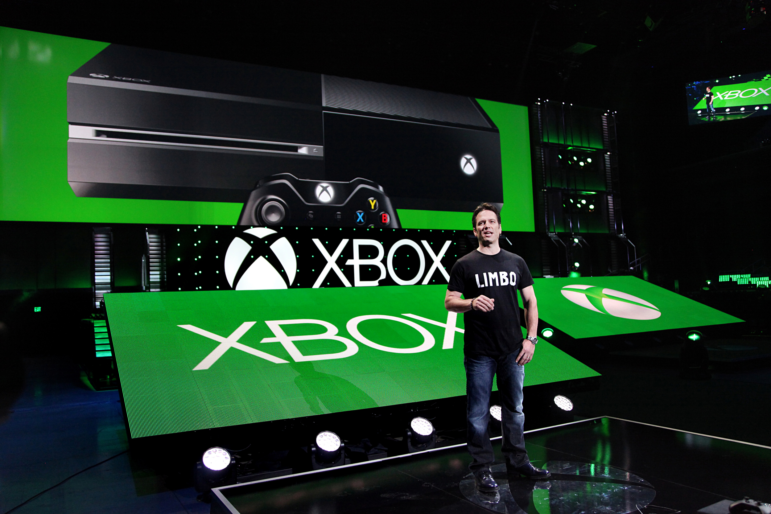
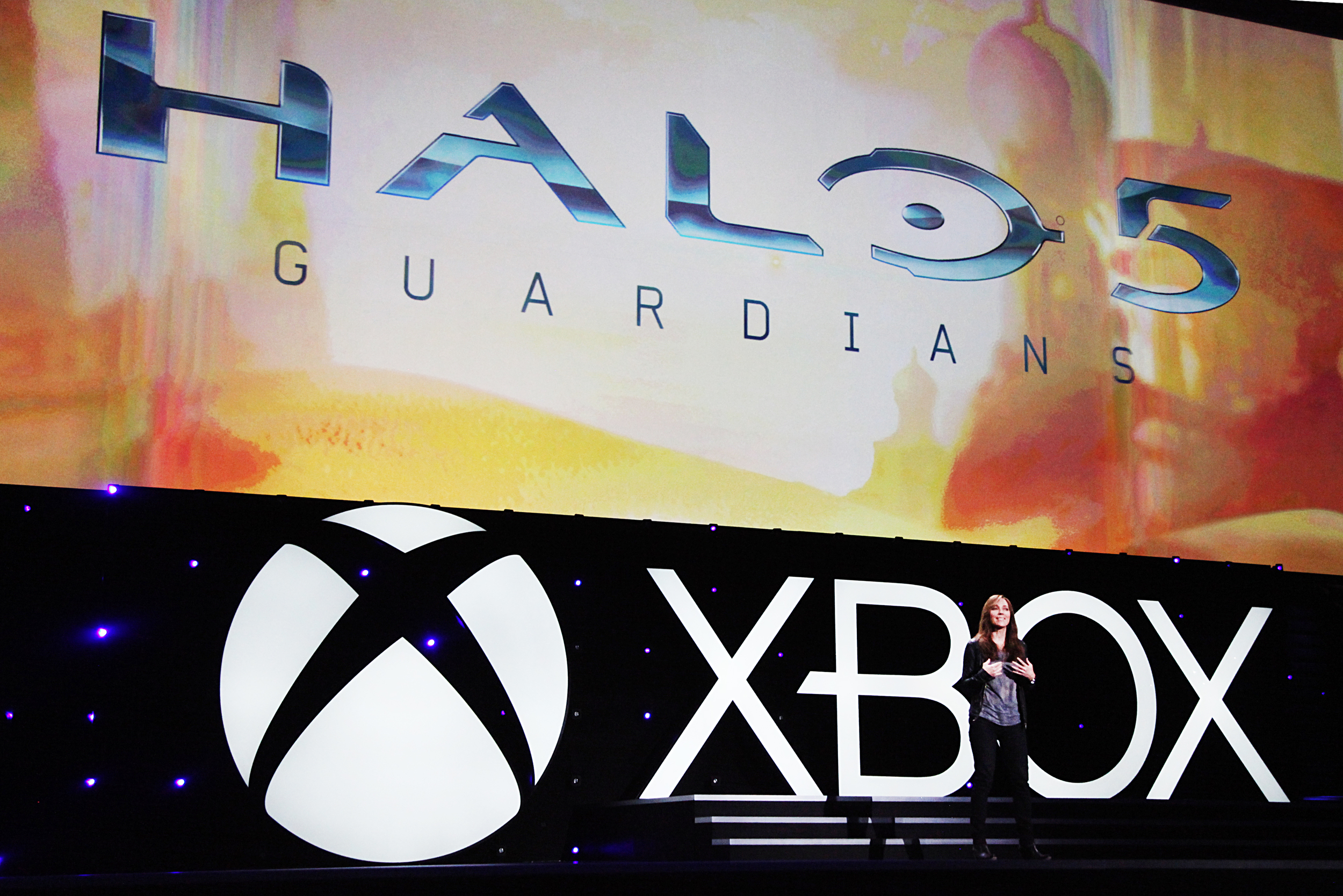
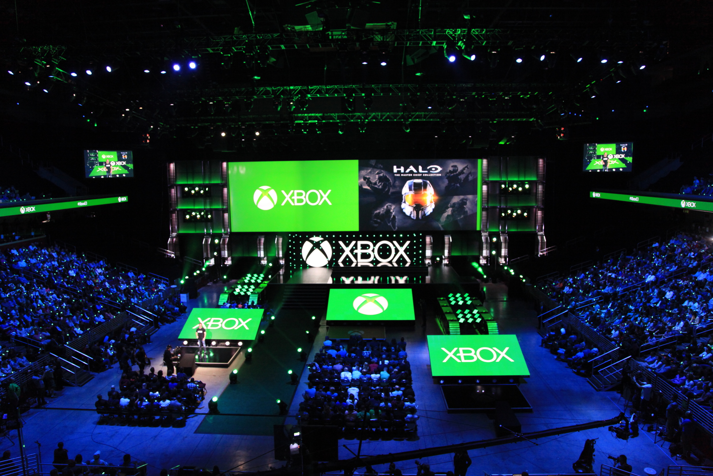
It was all games, games, and more games as Phil Spencer from Xbox too the stage at this years E3 Media Briefing.   Manny was asked again by our client, Zed Ink to be the Lighting Designer for the Media Briefing which was broadcast live on Spike TV.   This was Manny's 9th year lighting the project.

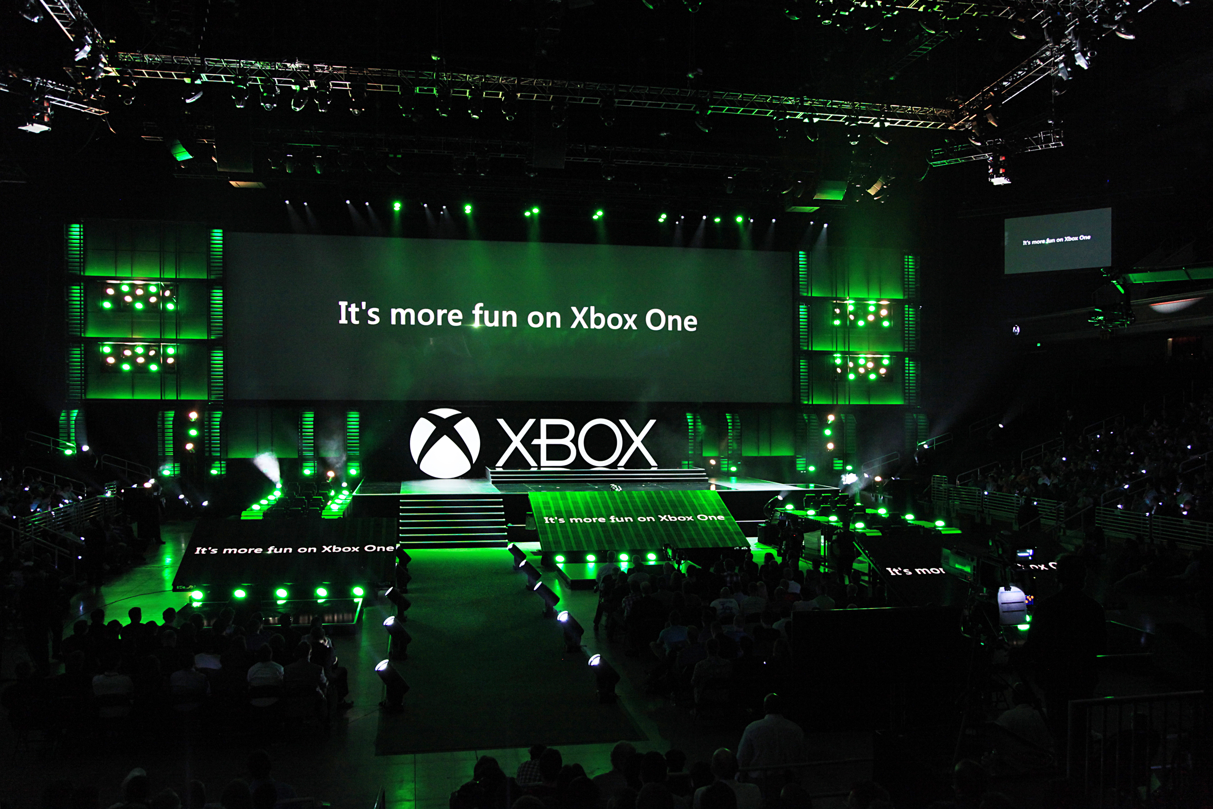
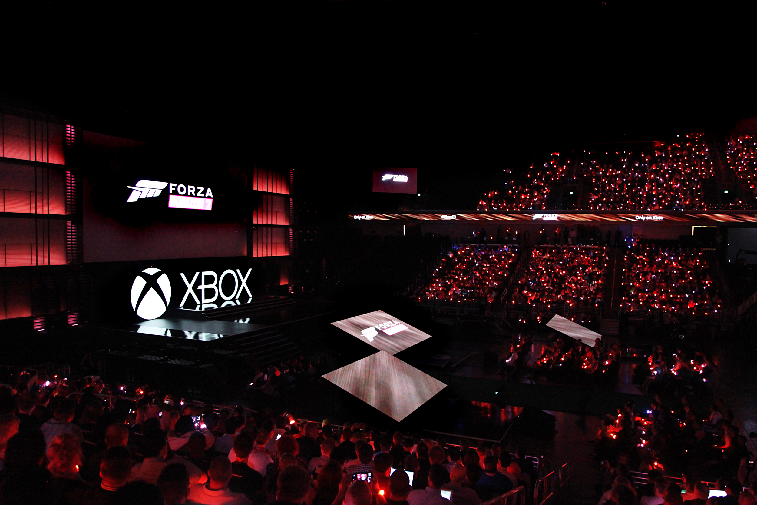
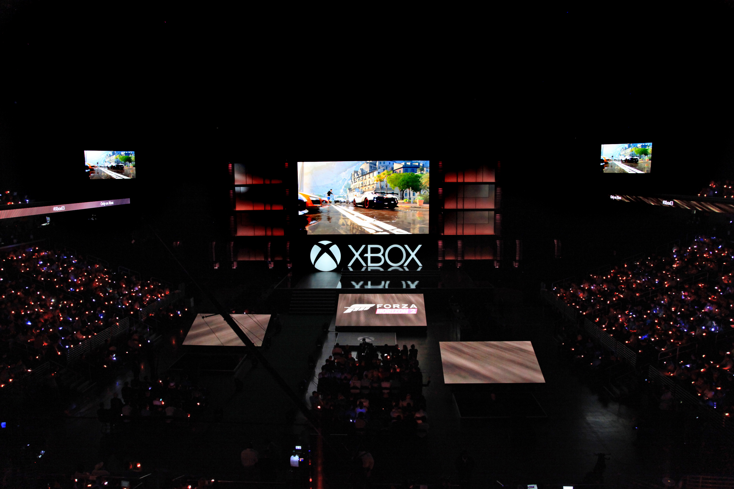
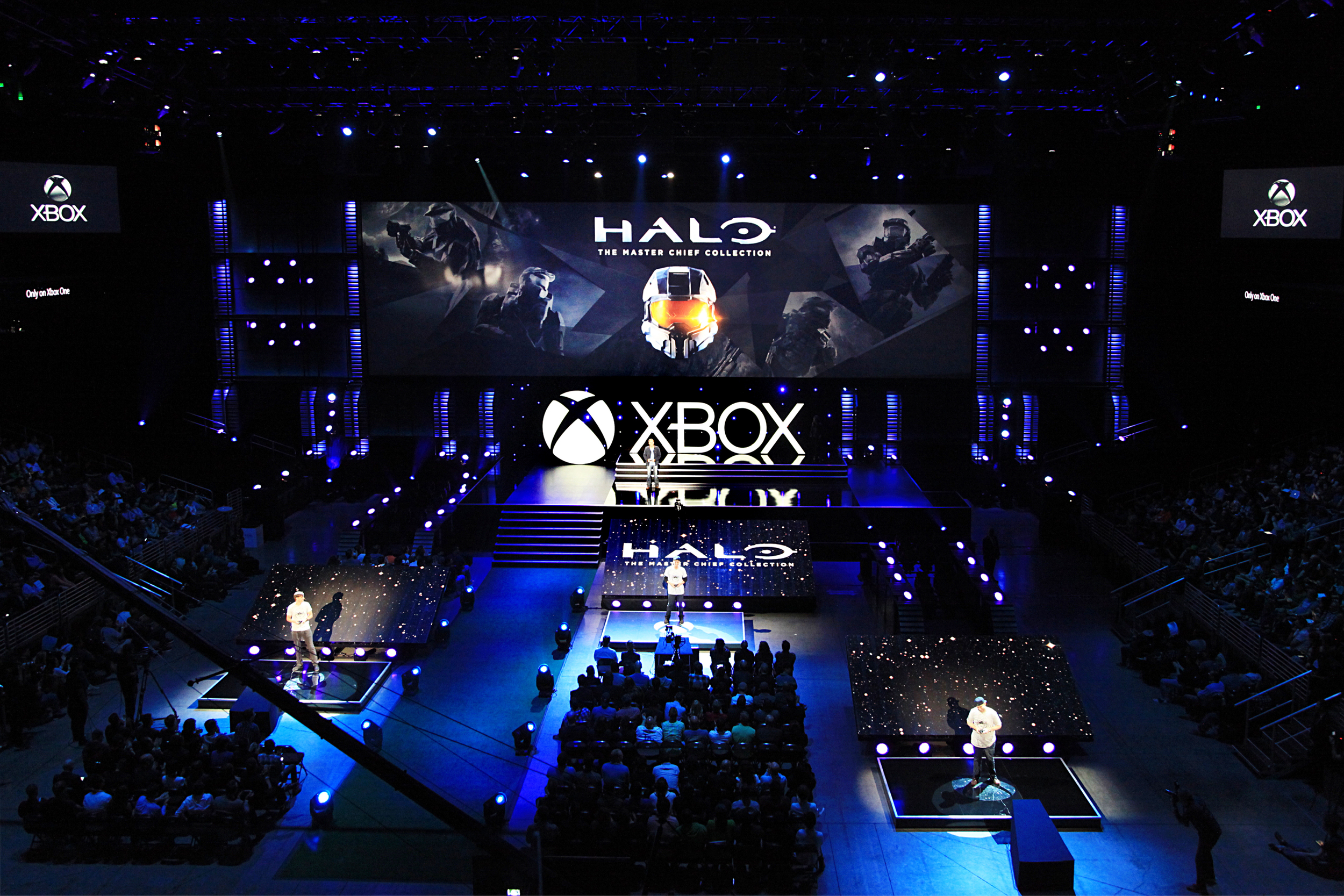
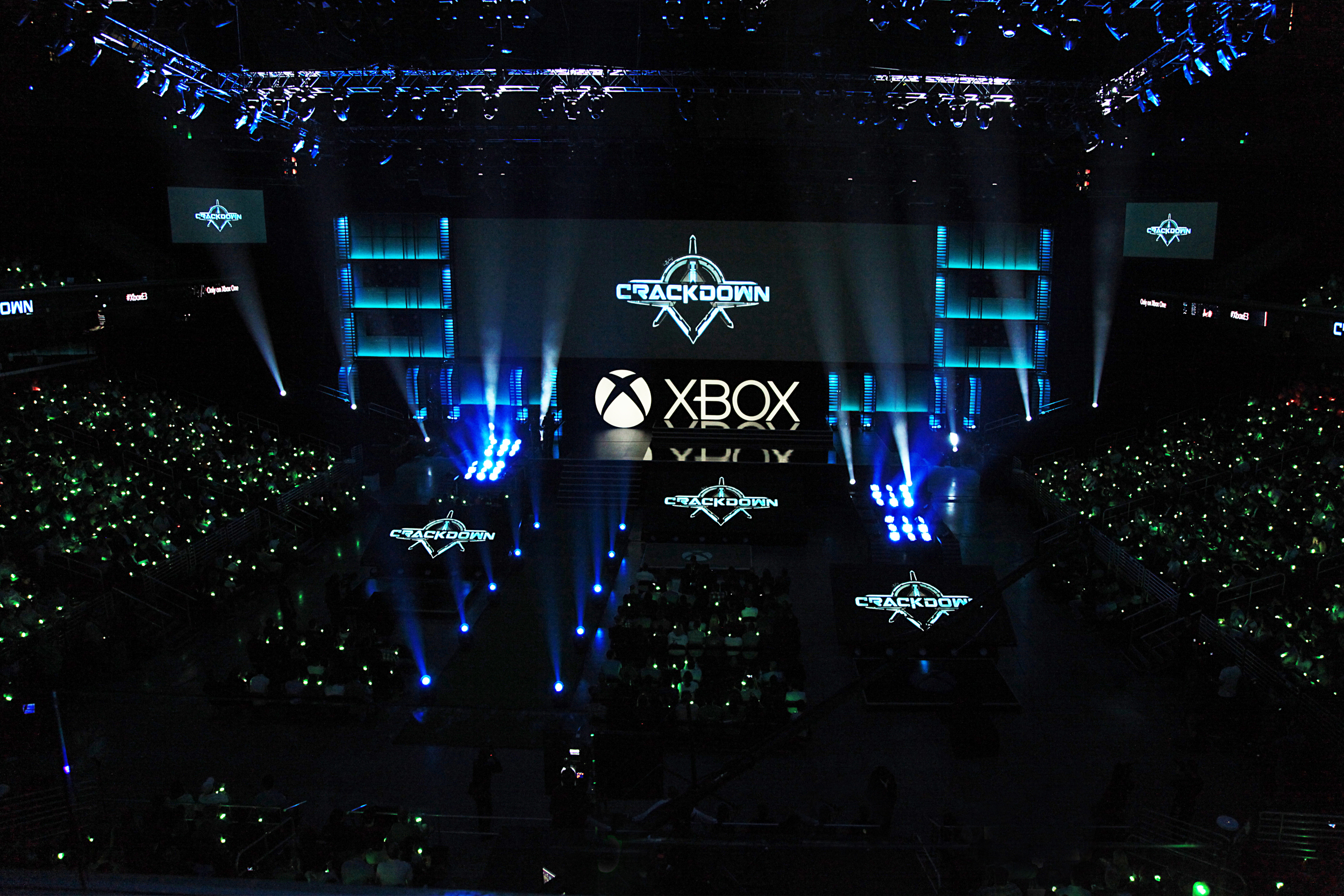
A major feature of this year's show was a design that brought the show more out into the audience.   Three satellite stages with scenic LED backing screens were place out onto the main floor of the Galen Arena.    Using the whole floor of the arena brought the presenters and the game demos closer to the audience and created a more intimate look on camera.

This year's set featured an ultra aspect ratio screen with track masking elements to close it down when needed.  This created many technical challenges.  We chose to solve them by attached integral lighting to the scenic elements so their lighting quality traveled with them as they moved.    It also allowed the programming of the show to be agnostic from the position of the scenic walls.   If the creative team chose to change the placement of a tracking cue it did not requite a refocus on our part

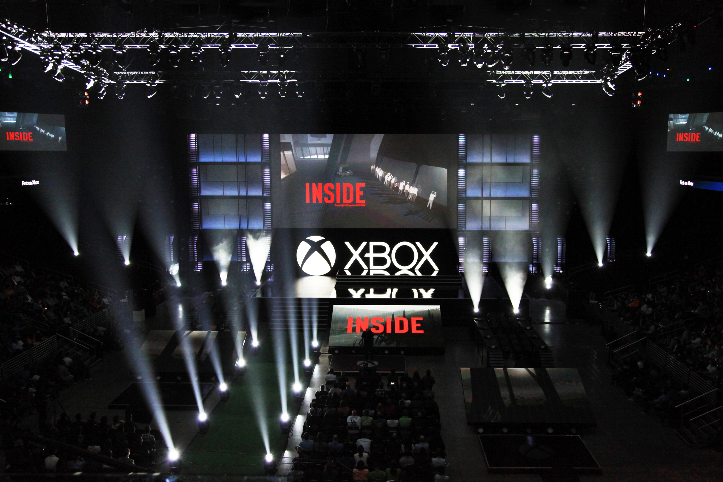
Erin Hearne Williams, Zed's Creative Director for the show also wanted to immerse the audience more into the show and have that be reflected on the broadcast.  She added LED bracelets from Pixmob that could be controlled as part of our lighting system.  This opened up a whole new world of visual effect that turned the audience into surrounding backdrop for so many of the camera shots seen at home.   

Evening Showcase

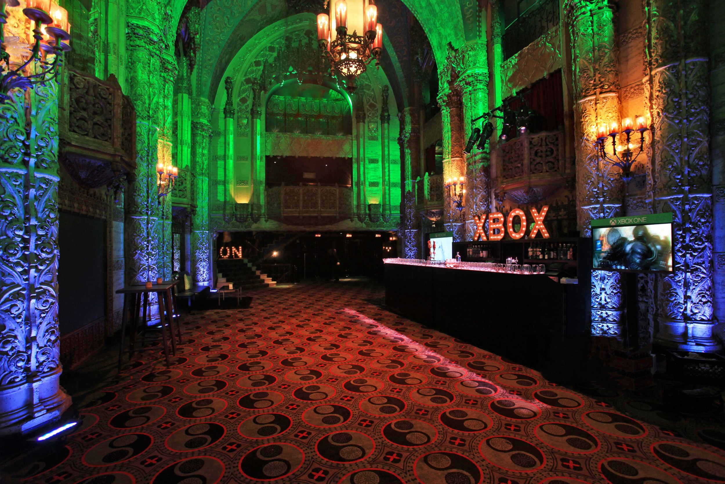
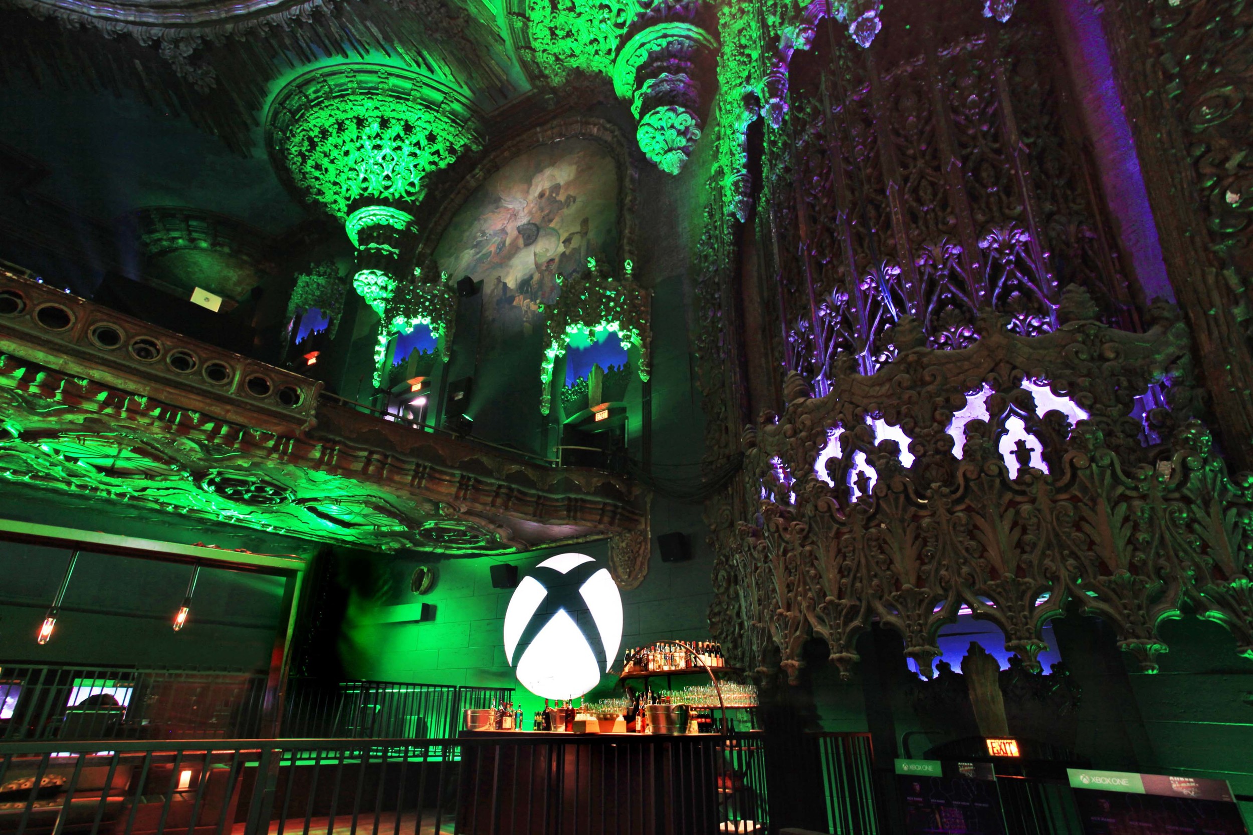
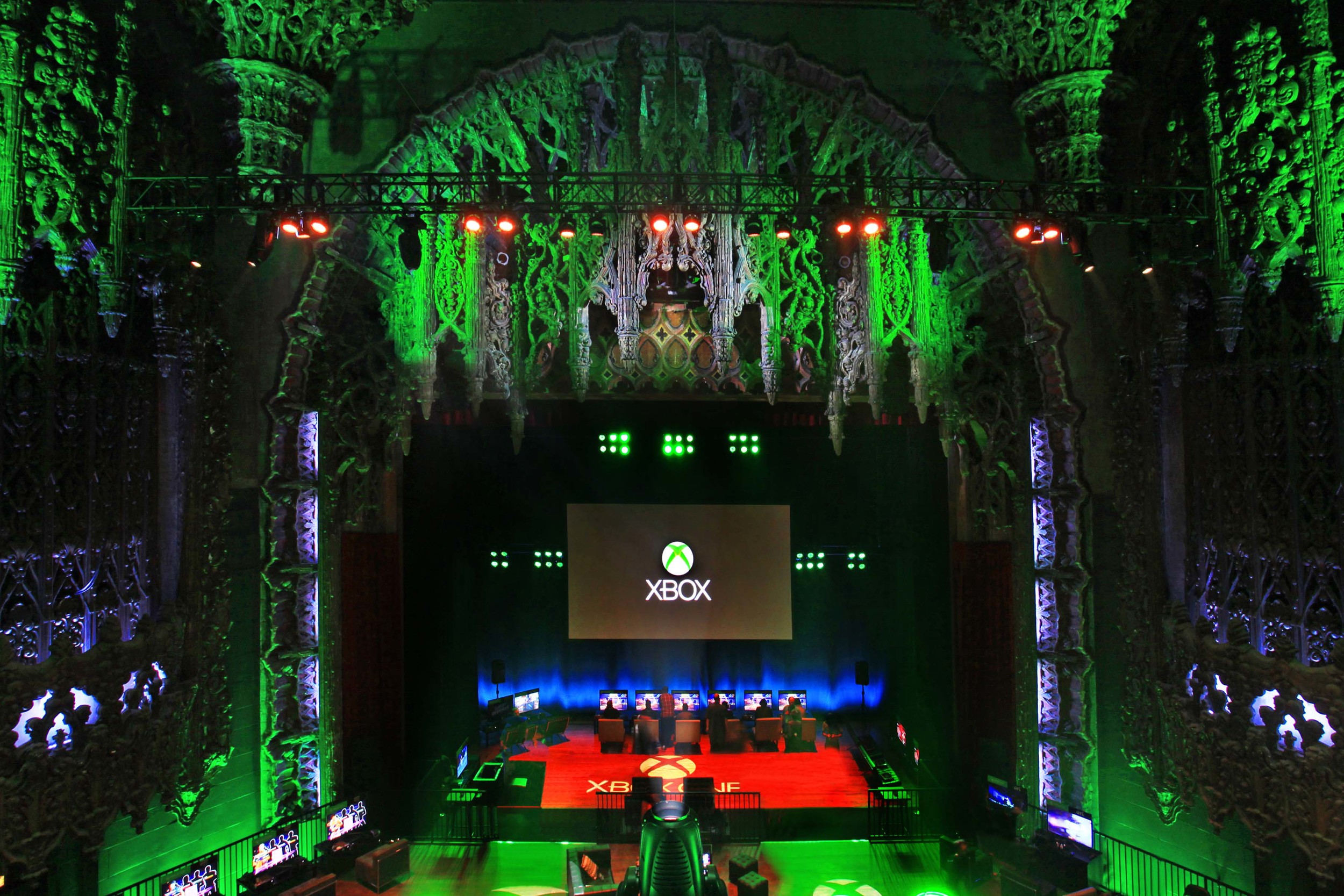
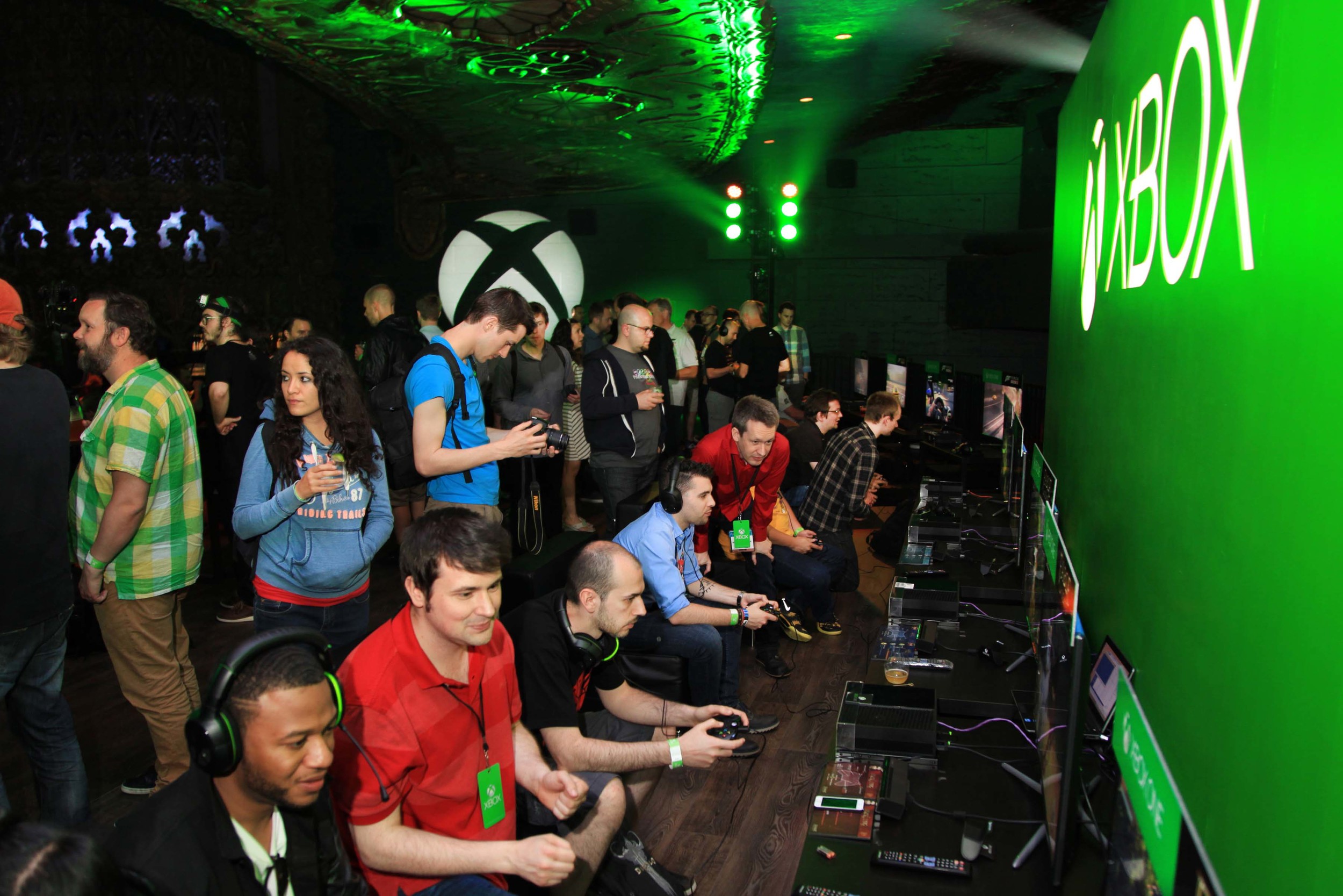
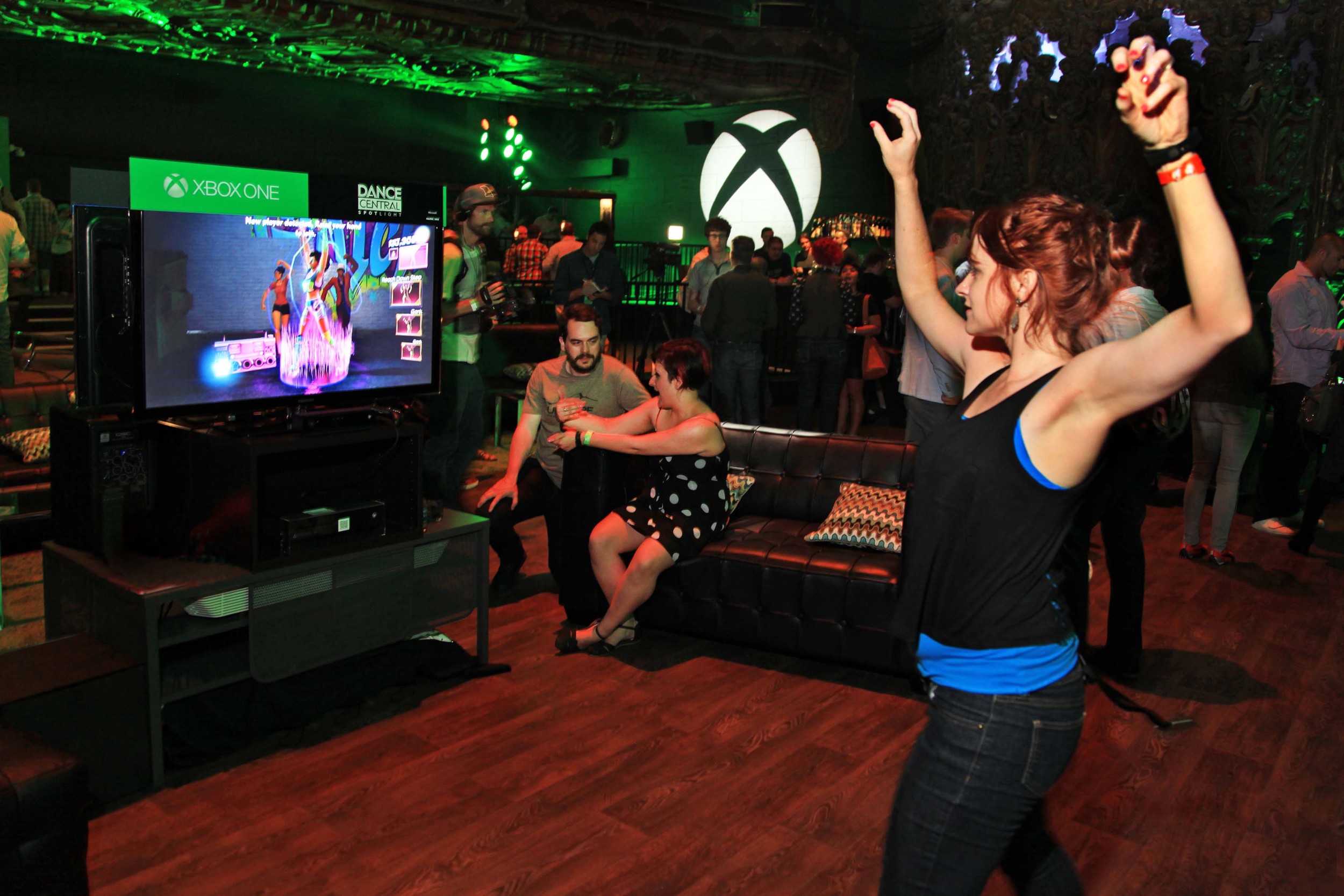
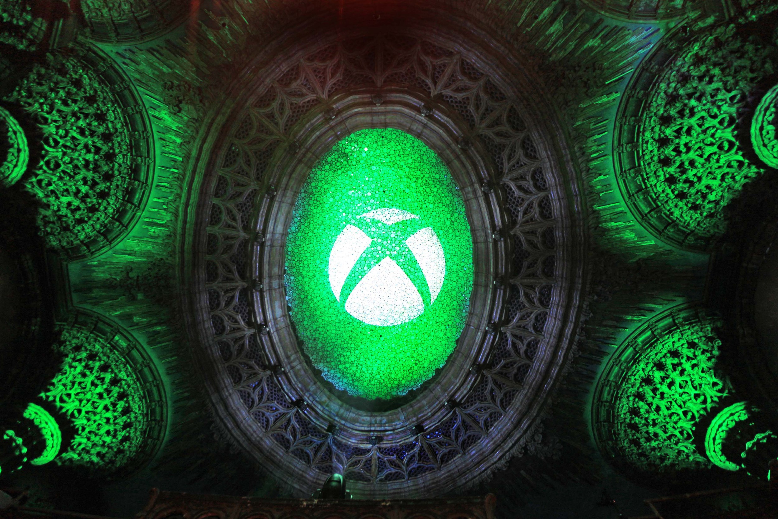
This year both Manny and Brian also designed the Xbox Showcase.   The location is always an iconic downtown venue.  This year was no exception and the event took place at the recently renovated Ace Theater.   Its rich architecture, painted in the brand colors of Xbox become a photogenic backdrop for debut of game play from so many of the new titles coming out this year.